

Dashboards designed to make decisions
A good dashboard isn't the one that shows the most graphics, but the one that helps you make decisions. In Pyplan, dashboards are designed as an extension of the planning model, not as isolated reports.
For years, dashboards were used to “look at the business”. But looking is not enough when the context changes rapidly and decisions have an immediate impact.
The problem isn't the visualization.
The problem is when the dashboard is disconnected from the logic that explains Why the numbers are what they are.
Pyplan dashboards are born from another logic: show, explain and enable action.
Dashboards connected to the model
In Pyplan, each dashboard consumes information directly from the business model. There are no metrics calculated in parallel or duplicate logic.
This means that:
- the indicators reflect explicit rules,
- changes in the model are automatically reflected,
- and all users see the same reality, without cross-interpretations.
Examples by role, a single logic
Dashboards adapt to the user's role, not to the organizational silo.
An executive dashboard shows strategic trade-offs.
A tactical dashboard delves into scenarios and restrictions.
An operational dashboard accompanies daily management.
The visualization changes. Logic doesn't.
This allows decisions to be aligned at all levels without losing consistency.
Exploring causes, not just results
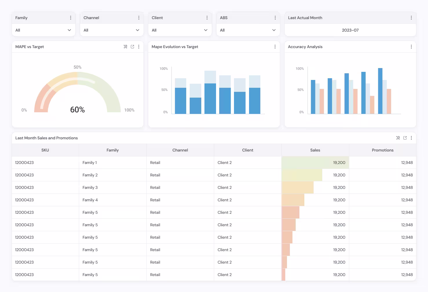
Pyplan dashboards allow you to navigate between levels of information, understand dependencies and analyze causes.
When a deviation appears, the user can:
- delve into the variables that explain it,
- compare alternative scenarios,
- evaluate impacts before deciding.
The dashboard ceases to be an end and becomes an entry point to the analysis.
Visualization at the service of the process
In Pyplan, dashboards are part of the planning flow. They are not subsequent reports, but active tools that accompany the decision process.
This reduces friction, speeds up meetings and improves the quality of conversations.
Seeing data isn't deciding. Deciding requires context, coherence and the ability to explore alternatives.
You might also be interested

Data governance for planning with confidence
Control, traceability and consistency in each Bajada number

Modeling the business, not just the numbers
How Pyplan's influence diagrams transform complex rules into clear decisions

Preparing data for better planning
Quality, structure and scalability from the first model
See Pyplan in action
we will get in touch with you!